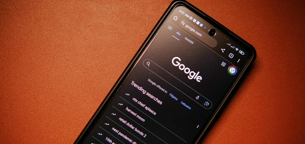
In the digital-first world of today, dark mode is not just a hip toggle switch—it’s a thoughtful UI choice that can increase user satisfaction, decrease eye strain, and make your brand look more contemporary and digital. But poorly executed, it can annoy users and damage accessibility. For business executives, it’s essential to grasp the psychological and practical effects of dark mode in order to realize its full potential.
ALSO READ: 4 Best Streaming Services till Date – You Have Em’ All
Why Is Dark Mode So Popular?
Dark mode isn’t only about being sleek. There are legitimate user-focused motivations for its prevalence.
- Less Eye Strain: Particularly in low-light conditions, dark interfaces minimize glare and enhance visual comfort
- Power Efficiency: OLED and AMOLED displays consume much less power rendering dark pixels
- Better Focus: Certain users believe dark backgrounds minimize distractions, making it simpler to focus on content
But popularity does not necessarily equal impact. For companies, the objective isn’t to keep up with design trends—it’s to improve user experience and increase digital performance.
The Psychology of Dark Mode
On a subconscious level, color palettes affect user behavior and emotional perception. Dark mode generally communicates:
- Sophistication and modernity (Apple or Tesla, for example)
- Calm and concentration, particularly for productivity applications
- Mystery or depth, which can be effective in entertainment or gaming contexts
But without careful implementation, dark mode can fail. Inadequate contrast ratios, bad color choices, or variable UI behavior may lead to eye strain, damage usability, and alienate customers.
Best Practices for Dark Mode Implementation
Below are a few best practices for implementing dark mode.
1. Make Readability and Contrast a Priority
Employ high contrast but not full white-on-black, which induces visual vibration. Opt for soft grays and off-whites for text. Have at least a 4.5:1 contrast ratio for body text to provide accessibility.
2. Save Brand Identity
Don’t let dark mode water down your brand. Vary color schemes with care to maintain visual parity between light and dark themes.
3. Test Across Devices
Dark mode rendering may vary on iOS, Android, and desktop browsers. Test extensively to maintain a flawless experience.
4. Provide User Choice
Allow users to switch between light and dark. Don’t require one experience for system settings unless it’s an essential part of your app’s core UX.
5. Use Semantic Colors
Reconsider how you use colors on buttons, alerts, and icons. Colors act differently on dark backgrounds and might need to be redefined to maintain clarity and meaning.
6. Don’t Ignore Microinteractions
Animations, hover states, and transitions must feel native in dark mode. A consistent experience creates trust and usability.
Takeaway for Business Leaders
Dark mode is more than an aesthetics preference—it’s a user experience differentiator. For digital applications, it has the potential to drive longer user sessions, enhanced satisfaction ratings, and even lowered support tickets from UI fatigue. But only when done correctly.
You, as a leader, are tasked with arming your design and development teams with the resources, research, and roadmap to implement dark mode accurately. Make user testing a top priority, invest in accessibility tooling, and most importantly, make sure that the UI complements—not constrains—your business objectives.
Dark mode is not just a switch. It’s a design choice that says a lot about how much you know your users.


